Thursday, July 31, 2014
Ando Font Download
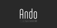
Ando is a condensed typeface family consisting of 5 weights.
Its modular design works particularly well for headlines & display use, where its soft curves & distinctive letterforms can create an instant eye-catching effect.
The fonts, provided in Opentype format, include standard ligatures, diacritics for most European languages and some Opentype features (case sensitive forms & proportional/tabular figures).


Wednesday, July 30, 2014

Hanyi Cu Song Font Download

This font is intended for use with simplified Chinese. It contains the GB2312 character set.
Old Venexia Font Download
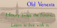
This is simply an excursion into the idea of taking a prototype and recasting it along different lines. It is primarily meant for the printed page.

Lil' Punk Font Download
Youthfully energetic, this unique typeface looks like it came straight from the hand of a skateboarding teenager. The quirky strokes and unrestrained characters convey the essence of early adolescence like no other font you will find.
Perfect for children’s books or publications appealing to an adolescent audience or for texts portraying unbridled youth.
Tuesday, July 29, 2014

Euroscript Pro Font Download

Euroscript Pro is the digital version of Ralph M. Unger’s handwriting, a very talented and hard-working German type designer. Unger has redesigned a large number of beautiful ancient typefaces during the last few years.
Peter Rosenfeld of profonts persuaded him to try and design his own very beautiful handwriting. Kind of hesitant at the beginning of the design process, Unger’s joy and excitement about the project was continuously growing during the design process.
He designed not only the standard character complement West, but added all of the Eastern European Latin glyphs and, on top of that, even the complete Cyrillic characters. Born and grown up in Thüringen, former East Germany, Unger has a fair knowledge of Polish and also Russian (Cyrillic).
More…
The individual characters combine quite easily and perfectly with no need for extra variants.

Monday, July 28, 2014
Earwig Factory Font Download

Earwig Factory is a scattering of jumbled cut-outs. In OpenType savvy applications, letters and numerals are pseudorandomized for a more natural effect. The letters and cards styles can be used to create compelling color/texture layers.
The cards style can be offset to create a drop shadow effect.
Thursday, July 24, 2014
Eknaton Font Download
The powerful Eknaton comes with slanted slabserifs, a new way to add some spring to the old Egyptian slabs. Eknaton echoes the tradition that started with Napoleon’s Egyptian campaign 1798, and the simultaneous looting of Egyptian art.
The imports led to new ladies fashion in Europe, new architecture and new typefaces like Antique (Figgins, 1815) and Egyptian (Caslon, 1816).
The Egyptian faces were also the origin of the famous Clarendon (1845) and Ionic No.5 (1925) as well as the rest of “the legibility types”.
More…
Swedish type foundry T4 premiere new fonts every month. Eknaton is our eleventh introduction.
Openline Font Download

An open inline typeface with a clean, modern feel; Openline offers a more contemporary alternative to Art Deco inlines from the 1920s. Both Regular and Bold versions are included.
RePublic Font Download
In 1955 the Czech State Department of Culture, which was then in charge of all the publishing houses, organised a competition amongst printing houses and generally all book businesses for the design a newspaper typeface.
The motivation for this contest was obvious: the situation in the printing presses was appalling, with very little quality fonts existing and financial resources being too scarce to permit the purchase of type abroad.
The conditions to be met by the typeface were strictly defined, and far more constrained than the ones applied to regular typefaces designed for typesetting books. A number of parameters needed to be considered, including the pressure of the printing presses and the quality of the thin newspaper ink that would have smothered any delicate strokes.
More…
The committee published its comments and corrections of the designs, and asked the designers to draw the final drafts. The winner was unambiguous — the members of the committee unanimously agreed to award Stanislav Marso’s design the first prize.
His typeface was cast by Grafotechna (a state-owned enterprise) for setting with line-composing machines and also in larger sizes for hand setting. Regular, bold, and bold condensed cuts were produced, and the face was named Public.
Drawings of the regular and italic cuts at the size of approximatively 3,5 cicero, that is 43 pt, were used as templates for scanning. Those originals covered the complete set of caps except for the U, the lowercase, numerals, and sloped ampersand.
The bold and condensed bold cuts were found in an original specimen book of the Rude Pravo newspaper printing press. These specimens included a dot, acute, colon, semicolon, hyphens, exclamation and question mark, asterisk, parentheses, square brackets, cross, section sign, and ampersand.
All the uppercase letters were fine-tuned, the crossbar of the A was raised, E, F and H were narrowed, L and R were significantly broadened, and the angle of the leg and arm of the K was adjusted.
The vertex of the M now rests on the baseline, making the glyph broader. The apex of the N is narrower, resulting in a more regular glyph. The tail of Q was made more decorative; the uppercase S lost its implied serifs.
In the lowercase ascenders and descenders were slightly extended. Corrections on the lower case a were more significant, its waist being lowered in order to improve its colour and light. The top of the f was redrawn, the loop of lowercase g now has a squarer character.
The diagonals of the lowercase k were harmonised with the uppercase K. The t has a more open and longer terminal, and the tail of the y matches its overall construction. Numerals are generally better proportioned.
Italics have been thoroughly redrawn, and in general their slope is lessened by approximatively 2–3 degrees. The italic upper case is more consistent with the regular cut. Unlike the original, the tail of the K is not curved, and the Z is not calligraphic.
The italic lower case is even further removed from the original. This concerns specifically the bottom finials of the c and e, the top of the f, the descender of the j, the serif of the k, a heavier ear on the r, a more open t, a broader v and w, a different x, and, again, a non-calligraphic z.
Originally the bold cut conformed even more to the superellipse shape than the regular one, since all the glyphs had to be fitted to the same width. We have redrawn the bold cut to provide a better match with the regular.
This means its shapes have become generally broader, and it is also noticeably darker. Medium and Semibold weights were also interpolated, with a colour similar to the original bold cut. The condensed variants’ width are 85 percent of the original width.
The design of the Condensed Bold weights were optimised for the setting of headlines, while the lighter ones are suited for regular condensed setting. All the OpenType fonts include small caps, numerals, fractions, ligatures and expert glyphs, conforming to the Suitcase Standard set.
RePublic is an exquisite newspaper and magazine type, which is equally well suited as a contemporary book face.
Wednesday, July 23, 2014
Ger Font Download
A set of historical Ossetic ornaments was designed by Lev Alborov in 1998 and licensed by ParaType.
Victoria Samuels Font Download
This font was originally designed for a chocolate box design project; it does have something of a luxurious quality.
Burlington Font Download
This stately modern Roman face was designed by eminent English lettering artist Alan Meeks. It evokes a 1940’s style with its strong upright characters emphasized by the half-solid, half-open feature throughout.
This regal typeface benefits from wide letter spacing.
Monday, July 21, 2014
Aldus nova Com Font Download

Hermann Zapf and Akira Kobayashi redeveloped Palatino for the 21st Century, creating Palatino nova. The Palatino nova family also includes revised versions of Aldus (now called Aldus nova).
A bold weight is added into the font family.
The character set support is similar to Palatino nova, but Greek and Cyrillic are not available in book weight fonts.
Frank Flowers Font Download
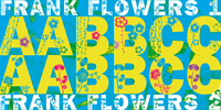
Frank Flowers are fonts with flowery embellishments. They are useful for all kinds of celebrations, but they also have lots of impact. There are only uppercase letters even on the lowercase keys.
Uppercase and lowercase look different, so you can mix them. You can even mix the two sets, it'll look great. I had a lot of fun doing these fonts and I want you to have some fun as well.
That’s why I sell them very, very cheap, even cheaper if you buy the pair!
-Your typedesigner for unusual solutions Gert Wiescher
Sunday, July 20, 2014
dearJoe 1 Font Download

DearJoe 1 is the first of four handwritten scripts by JOEBOB graphics.
It includes a complete character set with numbers and most (but not all) special signs.
Standing Room Only NF Font Download
Here’s an Art Deco classic with a bit of an edge. This typeface is based on a somewhat less refined but more energetic version of Broadway, designed by Morris Fuller Benton for ATF in 1928, originally named Broadway Poster.
Both versions of this font contain the complete Unicode 1252 (Latin) and Unicode 1250 (Central European) character sets, with localization for Romanian and Moldovan.
Romany Font Download
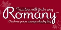
The Romany font is an non-connecting script which was originally designed by A.R. Bosco and released by American Type Founders in 1934.
Romany is particularly useful for a Valentines greeting but is equally at home with spring blooms or an art deco themed New Year.
Revitalized by Ascender’s Terrance Weinzierl, Romany brings a touch of informal class to headlines, cards, invitations and thank you cards.
Character Set: Latin 1.

Saturday, July 19, 2014
From The Internet Font Download

From the Internet is a narrow, square-sans font family designed for future use. The design was derived from the From The Stars font family. In OpenType savvy applications, you can access an alternate f and t using the stylistic alternates feature.
Holier Than Thou Font Download
Look well, Fontlovers, we wouldst have words with thee! By Odin’s beard, let the naysayers beware, for 'tis true, Thor doth speak --and shouldst speak -- Mighty Words! Yay there shall be a “Thee” and a “Thou” and a “Thy” and a “Smite!” Verily, 'tis understood that Elizabethan English dost suit the Gods of Asgard, mortals can never get enow.
Snow Font Download
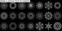
The inspiration behind Snow, Kapitza’s 2009 festive font, is the beauty of snow crystals and the interplay between their unique designs.
Friday, July 18, 2014
Hire Me Font Download
A professional-looking original typeface that can be used in resumes, curriculum vitae, business communications, and e-mails, this font contains the subliminal message “hire me” embedded into each of its characters.
Use it in your resume, cover letter, and written communications with a potential boss, hiring manager, recruiter, Human Resources department, or anyone who may have a say in the decision to employ you.
In this tough job market, you can use every advantage you can get. More…
Milafleur Font Download

Milafleur presents the second member in the series of pictorial fonts with calligraphic miniatures by Lyudmila Mikhailova. The first font of the series, Milanette, was released one month earlier.
Milafleur contains more than 60 pictures -- mostly flowers which define the origin of its name. In contrast to Milanette the pictures in Milafleur are less abstract and thus can be used as small illustrations in greeting texts, postcards, intimate notes, diaries and even in Christmas cards because some of the pictures show strobiles instead of flowers and coniferous branches instead of leaves.
Released by ParaType in 2011.
Big Mom Font Download

Big Mom is a extended Version of Love Mom which is made for old-school Tattoo designs like old sailors Tattoos.
Big Mom comes in many styles. Alternates Caps and alternates ends are included in all Versions.
You can also combine the two fonts (Love-Mom & Big-Mom) because both are based on the same metrics.
Adobe Caslon Pro Font Download
William Caslon released his first typefaces in 1722. Caslon’s types were based on seventeenth-century Dutch old style designs, which were then used extensively in England. Because of their remarkable practicality, Caslon’s designs met with instant success.
Caslon’s types became popular throughout Europe and the American colonies; printer Benjamin Franklin hardly used any other typeface. The first printings of the American Declaration of Independence and the Constitution were set in Caslon.
For her Caslon revival, designer Carol Twombly studied specimen pages printed by William Caslon between 1734 and 1770.
The OpenType “Pro” version merges formerly separate fonts (expert, swash, small caps, etc.), and adds both central European language support and several additional ligatures. More…
Wood Font Two Font Download

A display and decorative font built upon the theme of wood. Great for display purposes in projects about nature and environmental topics.
Wednesday, July 16, 2014
Coptic Alphabet Font Download
Based on the writing used by the Copts in ancient Egypt, the font includes alphabet and numeral symbols.
NOTE: this font comes with a comprehensive interpretation guide in pdf format.
Washington Square NF Font Download
A titling font, combining caps inspired by the work of lettering artist Samuel Welo, and a lowercase based on the work of Lucian Bernhard.
Both versions of this font contain the Unicode 1252 (Latin) and Unicode 1250 (Central European) character sets, with localization for Romanian and Moldovan.
Subscribe to:
Posts (Atom)